Province Names In Grand Strategy Games
If you've ever seen a strategy by Paradox then you know what this article is about.
Games like Europa Universalis or Crusader Kings have maps divided into provinces - irregular polygons. Each province has a name that displays inside of the province. The text is positioned and bent to nicely fit the shape of the region.
How to approach it
I don't know how programmers at Paradox solved it. But it doesn't matter. Let's think of possible solutions:
- define the text position manually for each province,
- run a physics simulation to constrain the text's position and shape,
- just put it in the center,
- use geometry and mathematical formulas
And probably many more. Plase tell me in the comments if you have any other ideas.
The manual way
This approach may be a good fit if you want the text to be absolutely perfect and have no need to dynamically change it. And if you don't have a lot of provinces.
In a typical grand strategy wargame you may want to group regions and display a single name along all of them, though. Like "France" or "Paganism". And France may gain and lose provinces. Denizens of some areas may convert to other religions. Placing the text manually just won't cut it in those cases because you would need to define its' position for every single state of the game world.
A physics simulation
I haven't tried this approach but I can imagine this working. You could do it like this:
- make the borders of the province static bodies,
- represent the text by a rigid body rectangle internaly (or a chain of connected rigid bodies for possibly even better results)
- connect the text to the borders with some kind of constraints (e.g. spring joints)
- let the simulation run until the text is stable
This is the most heavy solution but also the only one on my list that could produce bent text (apart from the manual one). If anyone will actually try it, please let me now.
Just put it in the center
This is the least sophisticated automatic way I can think of. It just may work if all your regions are simple shapes with similar size. Obviously there are better ways.
But even with this naive approach there is one issue to think about. Where is the center of a polygon?
Maybe it's just the average of all vertices. In my code a polygon is represented by an array of vertices (of type Vector2 from ThreeJs library). Snippet in typescript:
const textCenter = polygon
    .reduce((total, current) => total.add(current), new Vector2(0, 0)) // sum all vertices
    .divideScalar(polygon.length) // divide the sum by the total number of vertices to get the average

drawNameAt(textCenter)
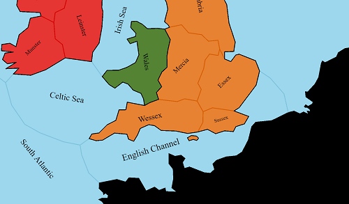
Wow, what happened to the waters? North Sea, South Atlantic and especially North Atlantic aren't at what you'd call "center".
This is because the average point is where most of the vertices are. For provinces like Northumbria, that has its vertices spread out equaly along the border, this is fine. But North Atlantic has two vertices at the top of the map and a lot of them along the coast of Irland.
So where is the center?
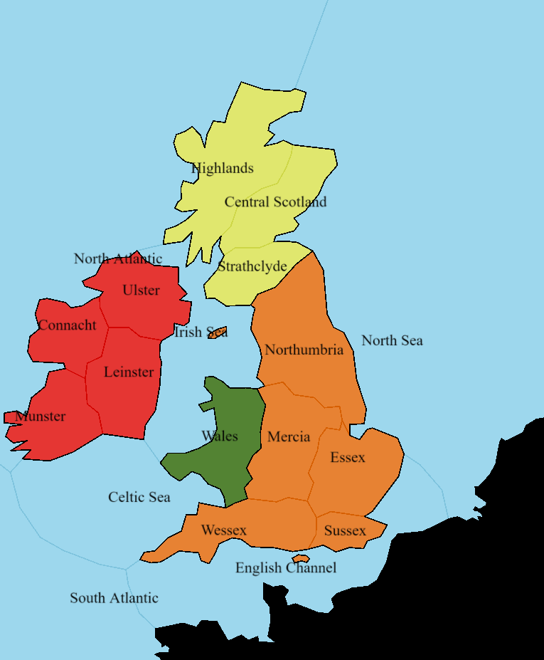
The best kind polygon "center" for our use is a so called centroid. You can think of centroid as a point at which you could perfectly balance the polygon if it were made from paper. I won't go into details about how to calculate it because it's fairly simple and there already are good articles on this topic on the internet. And obviously you can always just google "centroid stack overflow" for sample implementations.
This is a lot better. There is a lot of space for improvements, though. All the names have the same rotation and they sometimes intersect with the borders. Let's move on to the final approach.
Clever geometry and math
With a little bit of experimentation, I've come up with an algorithm which can position the text quite nicely. I'll show how to implement it gradually.
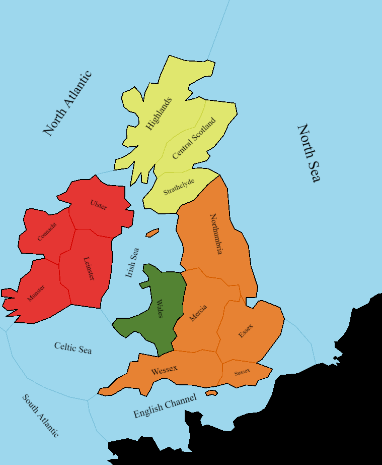
Disclaimer: The map you see on the screenshots is part of an online strategy game I'm working on with a friend for over a year now (as of writing, it's not released yet). I disabled most of the features like castles, armies, forests, etc for the sake of this article. You can still see two small islands, though (at Irish Sea and the English Channel). They are seperate entities from provinces. Please ignore them in this article.
Rotation
Let's start with the centroid approach I already talked about. It's a good starting point.
It can be vastly improved by rotating the text to better fit the shape of the region. If a province is long and high the text should be more vertical (just take a look at Central Scotland). I've found that a simple way to calculate the "angle of a province" is as follows:
- iterate all vertices and find a pair of the most distant ones (from each other)
- treat this pair as a line segment from point A to point B. In case of convex polygons, this is equivalent to the longest line that can fit inside it
- calculate the angle between this line and the X axis
This is how it may look like in code:
function mostDistantPolygonPoints(polygon: Vector2[]): [Vector2, Vector2] {
    let maxDistance = polygon[0].distanceTo(polygon[1])
    // a typescript tuple, think of it as of 2-element array if you don't know what that is:
    let furthestPair: [Vector2, Vector2] = [polygon[0], polygon[1]]

    // iterate all possible pairs of vertices
    for (const point1 of polygon) {
        for (const point2 of polygon) {
            const distance = point1.distanceTo(point2)

            // if the distance between current points is bigger than the biggest we know about so far, update our knowledge
            if (distance > maxDistance) {
                maxDistance = distance
                furthestPair = [point1, point2]
            }
        }
    }

    return furthestPair
}

// be aware this function returns radians, not degrees
function pointsAngle(point1: Vector2, point2: Vector2): number {
    return Math.atan2(point2.y - point1.y, point2.x - point1.x)
}

// ...

const textCenter = polygonCentroid(polygon)

const longestLine = mostDistantPolygonPoints(polygon)
let rotation = pointsAngle(longestLine[0], longestLine[1])

drawNameAt(textCenter, rotation)
This code results in some names being upside down. To prevent it we can simply correct/limit the angles:
if (rotation < 0) {
    rotation += Math.PI
}
if (rotation > Math.PI / 2) {
    rotation -= Math.PI
}
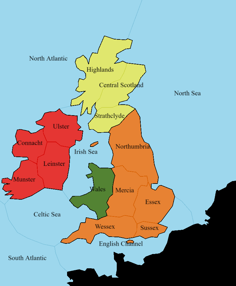
This looks a lot better! Central Scotland, for instance, fits the province perfectly. Arguably some names (like Leinster or Wales) are too vertical. You can of course just adjust the angles to fit your liking.
However, there still is a big issue. Look at the English Channel. Yeah, the name fits the province, but the centroid is definitely not the best spot in this case. The text is too close to the border. This is mainly because the channel's shape is exceptionally irregular and concave.
We can do better than centroids
Let's take a closer look at what we've done so far. This is the English Channel alone, with the centroid and the line that we take the angle from marked red:
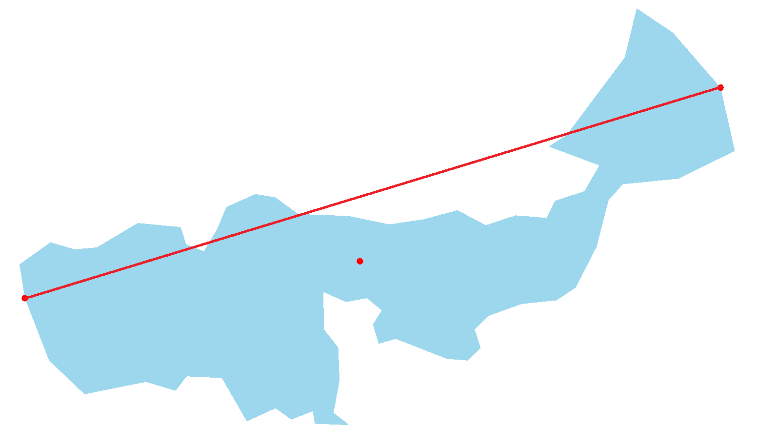
It's clear that when we draw the text at the red dot with the rotation matching the rotation of the line the text doesn't have a lot of space. This is because the algorithm is unaware that the polygon is concave.
Let's make the line a bit longer and translate it so that it goes through the centroid:
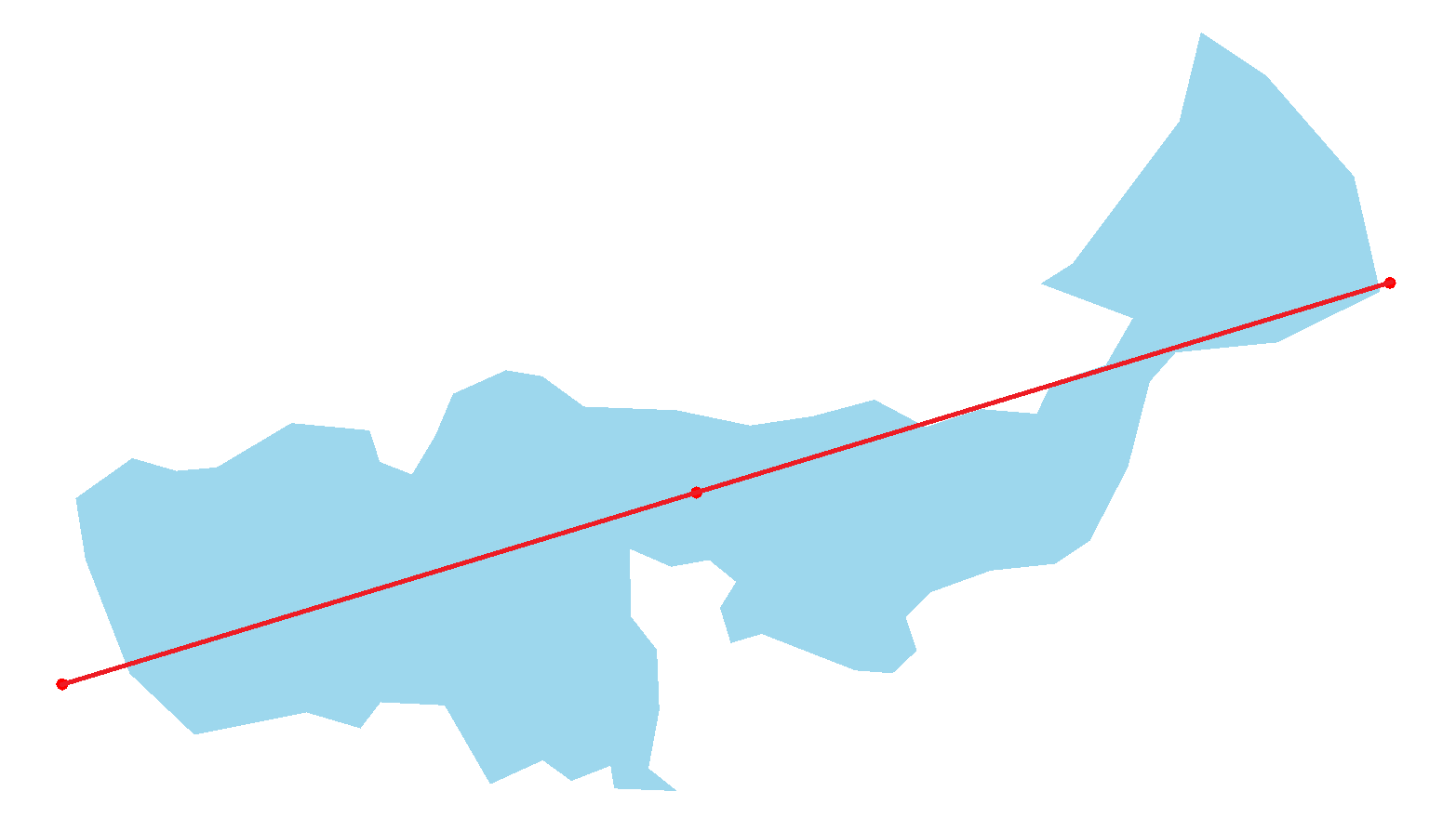
Nothing has really changed since we're only using the line's angle anyway. But now let's make the line intersect with the province borders:
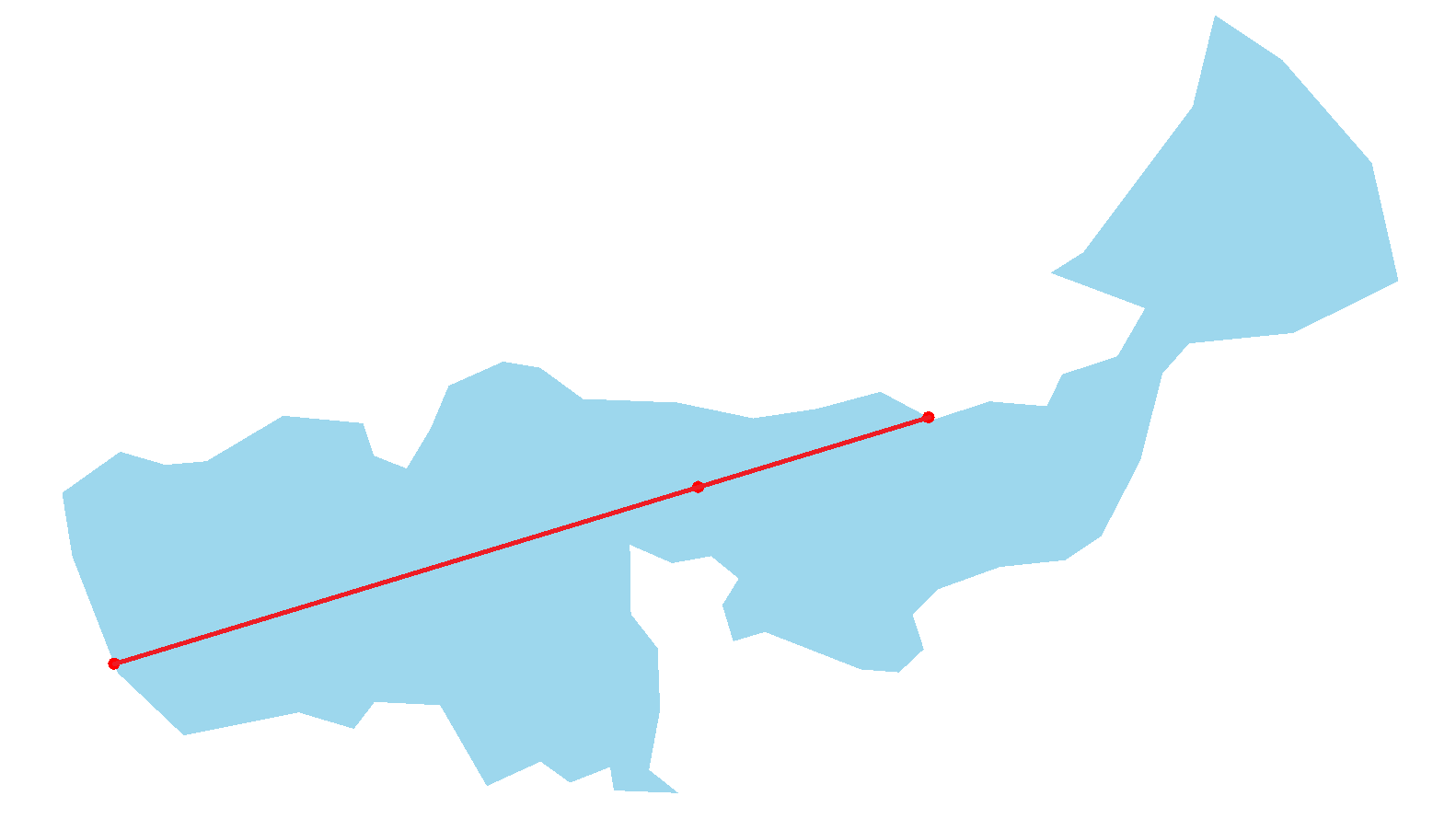
This line now determines the space that the text can freely occupy. We can just draw the text at the center of this line. For most provinces this new point is very close to the centroid but it really makes a difference for more irregular regions.
The code
This is a sample implementation of this method:
// point in the middle of the line is just the average of two points
function lineMiddle(line: [Vector2, Vector2]): Vector2 {
    return new Vector2(line[0].x + line[1].x, line[0].y + line[1].y).divideScalar(2)
}

function lineLength(line: [Vector2, Vector2]) {
    return line[0].distanceTo(line[1])
}

// returns the point from the array closest to the specified point
function closestPoint(point: Vector2, points: Vector2[]): Vector2  {
    // sorting is not the most efficient way but it's just an example
    return points.sort((a, b) => a.distanceTo(point) - b.distanceTo(point))[0]
}

// constructs a line from a starting point, length and angle
function lineFromPoint(point: Vector2, length: number, angle: number): [Vector2, Vector2] {
    return [
        point.clone(),
        new Vector2(Math.sin(angle) * length, Math.cos(angle) * length).add(point)
    ]
}

// returns the list of points at which the line intersects with the polygon's border
function linePolygonIntersections(line: [Vector2, Vector2], polygon: Vector2[]): Vector2[] {
    // implementation ommited for brevity
    // basically iterate over all segments of the polygon and check for collision with them using math or a library
    // sample solution: https://www.geeksforgeeks.org/check-if-two-given-line-segments-intersect/
}

// ...

const provinceCenter = polygonCentroid(polygon)

const longestLine = mostDistantPolygonPoints(polygon)

let rotation = pointsAngle(longestLine[0], longestLine[1])
rotation = correctAngle(rotation)

// this creates 2 lines starting at the centroid and going in the opposite directions. You could also make a version using one line with the center at the centroid
// the lines have the length of the "longestLine" so that they will for sure intersect with the polygon
const guardLine = lineFromPoint(provinceCenter, lineLength(longestLine), -rotation - Math.PI / 2)
const guardLine2 = lineFromPoint(provinceCenter, lineLength(longestLine), -rotation + Math.PI / 2)

// get all points at which the lines intersect with the border
const guardIntersections = linePolygonIntersections(guardLine, polygon)
const guardIntersections2 = linePolygonIntersections(guardLine2, polygon)

// construct the final line
// we're only interested in the first point the line intersected with
const textLine: [Vector2, Vector2] = [
    closestPoint(provinceCenter, guardIntersections),
    closestPoint(provinceCenter, guardIntersections2)
]

const textCenter = lineMiddle(textLine)

drawNameAt(textCenter, rotation)

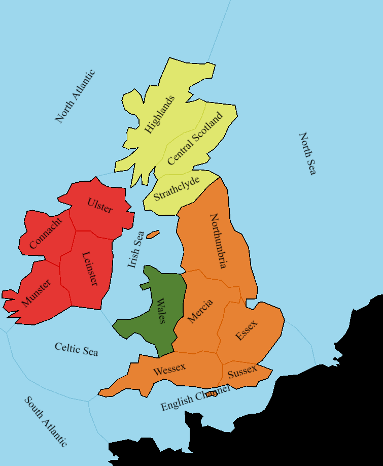
Nice! Most names are practically unaffected but the English Channel looks great now.
Text size
This is the last issue I'm going to talk about. Right now the text size is constant and arbitrary. Because of this the text may still intersect with the borders if the province's name is too long compared to its' size.
Fortunately, we know exactly how much space the text can safely take. It's determined by the length of the line we draw the text along (textLine in the above code snippet). How exactly the line length should correlate to the text size is entirely up to you. You may use it to just truncate the text size if the province is too small.
For the game I'm working on I found that the following equasion gives satisfactory results:
// ...
const size = Math.sqrt(lineLength(textLine)) * 1.75
drawNameAt(textCenter, rotation, size)
I think that different text sizes look especially good on the big water regions.
What's next
I'm sure this solution can be improved upon and modified to suit different games. Maybe I'll explore other options some day. For now, please let me know if you have any questions or ideas.
I'm soon going to write an article on how we use Inkscape to create maps for the game from the screenshots. If you're interested in tutorials like this one or in the development of the game join my mailing list to be notified about the articles.